Tropicana Amplifies Its Orange with a New Identity by Sunhouse
Bath-based brand and packaging design agency Sunhouse has redesigned OG orange juice brand Tropicana, using heritage in a contemporary way to position it as the category leader and aligning with its new campaign, 'THAT juice'.
The studio became involved in the project through its longstanding partnership with Tropicana Europe senior vice president Mick Van Ettinger. "We love Mick's drive, ambition and trust in our ability to unearth something meaningful and differentiated to transform a brand through the identity, having originally experienced this with Mick leading the revolutionary brand redesign for Magnum ice cream," says Sunhouse creative director James Giles.
According to Giles, working with a brand as iconic as Tropicana was a no-brainer, although he admits that the notorious and highly publicised redesign failure in 2009 added "an element of design-press jeopardy that ignited the creative team".
© Tropicana
© Tropicana
Tropicana's rebrand coincides with a shift in the category, likely due to the turbulent economy of recent years. Branded juices are increasingly being viewed as a commodity and in decline, with consumers opting for own-label juices instead.
Giles observes that the juice landscape has become "a sea of sameness". He explains how Tropicana relied on communicating its functional benefits to compete rather than investing in the brand and looking toward long-term growth.
"With an ambitious innovation pipeline and eyes on transforming to a beverages company, it was high time to re-establish their authority in a category they created in the first place," he says.
© Tropicana
© Tropicana
To strengthen Tropicana's position as 'the original' juice brand and differentiate it from competitors, Sunhouse essentially had to "look backwards to move forward", says Giles. After delving deep into Tropicana's history, the studio unearthed a variety of ownable narratives that they could use to breathe new life into the brand's visual assets.
"The care, craft and expertise that has been poured into every glass since 1947 was something we wanted to capture with a rich suite of assets to bring richness and depth to the identity," Giles explains.
One example is the story of Tropicana founder Anthony T. Rossi, who arrived in the U.S. from Italy with just $25 in his pocket and a dream to make fine fruit accessible to all. He founded the company in 1947 and found a way to package fresh juice and democratise what was considered a luxury until that point.
"He was a pioneer and an absolute original," says Giles. "That backstory, plus the fact the brand had never wavered from delivering fresh, pure juice straight from the source, kept pointing us back to 'originality', and we looked to celebrate this emotively with the brand's origins and functionally."
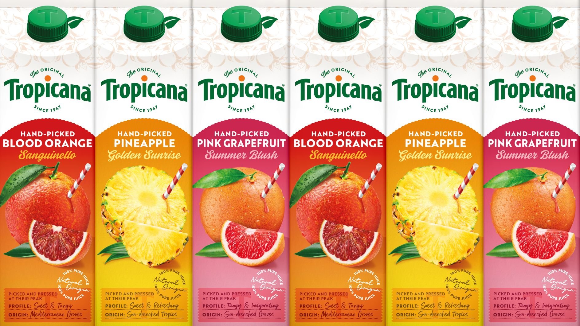
To do this, the orange was repositioned as the protagonist in the brand story, and the iconic straw, sticking straight into the fruit, was reintroduced. By amplifying what makes Tropicana unique, Giles says Sunhouse sought to create something "the copycats couldn't come close to".
© Tropicana
© Tropicana
He believes that the orange puts originality back at the heart of the story. The new logo now features an orange dotting the 'I', with 'The original since 1947' typography creating a roundel for the identity.
The roundel shape informed the graphic language across the rest of the brand world. Giles notes how Sunhouse also reintroduced the arch to the logotype in a bid to create "a more unique and uplifting symbol in line with the moments of joy and positivity the brand aims to spark daily across the globe".
"We refined the logotype and brought back the arch to optimise impact without compromising memory structures – always a challenge when working with a brand with such iconic credentials," he says.
© Tropicana
© Tropicana
To reflect the craft and care that goes into the product, Sunhouse chose Brother 1816 as the primary font. Its rough, handmade finish immediately signals authenticity and heritage. This is complemented by a set of display fonts, which are used sparingly to elevate the brand.
The studio also added new visual elements to the identity, such as Anthony T. Rossi's signature, a hand-drawn illustration of oranges, and a photograph of the original grove. Giles says: "Revisiting the brand's roots was integral to the evolution of the identity and reasserting leadership status in the category Tropicana created.
"The discoverable details amplify authenticity and elevate the brand as a beacon of quality and expertise in a category full of generic, function-led design codes."
Very subtle changes were made to Tropicana's colour palette to emphasise the role of orange. The hue was incorporated into the brand mark and pack lids to help increase visibility and ownability.


